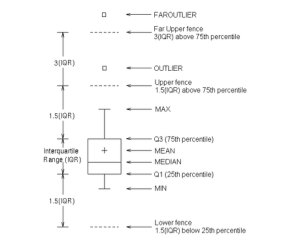
SAS Visual Analytics terms
Tools like SAS Visual Analytics and similar use terms like outlier and maximum and I wasn’t sure of the difference.
Today, I was looking at Box plots and while I could see the difference between an outlier and a maximum, I didn’t really know how each is calculated. Here goes….

Source: http://support.sas.com/documentation/cdl/en/grstatgraph/63878/HTML/default/viewer.htm#p0ou4qi2jfcokkn1ks5mx1ct5cmw.htm (November 2014)
While mean, medium and percentile are fairly clear, I’m not sure how the Maximum and outlier are calculated.
SAS defines the maximum and outlier as:
Outlier: an observation outside the lower and upper fences. The fences are located at a distance 1.5 times the Interquartile Range (IQR = Q3 – Q1) above and below the box
Max: maximum data value less than or equal to the upper fence.
Where:
IQR (inter quartile range) = Q3 – Q1
Q1 – 1st quartile (25th percentile). The data must contain a nonmissing value for this quartile.
Q3 – 3rd quartile (75th percentile). The data must contain a nonmissing value for this quartile.
A Course in Data Analytics
I’m doing a part-time course in Data Analytics at the University of Brighton. Seems like a good excuse to post some stuff here and see if my site gets a new lease of life.
I’ll probably post things on here that I need to know.